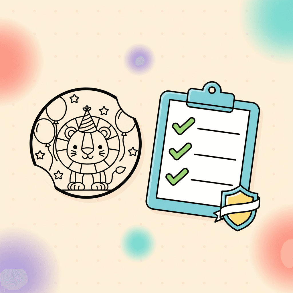
Parents and teachers do not want surprises from a kids' site. They want pages that are recognizable, appropriate, and easy to color.
This is the checklist we use to keep quality consistent.
How to use this checklist in 30 seconds
You do not need to study a page. You need a fast pass/fail.
Ask three questions:
- Can a kid name what it is?
- Do the lines look clean and easy to color?
- Does the page feel safe and appropriate?
If the answer is "yes" three times, you have a strong pick.
1) The subject is clear in one glance
If a kid cannot tell what the page is, they will not want to color it.
We check:
- the main subject is centered
- the silhouette is clear
- there is one obvious place to start
Why it matters:
- Kids commit faster when they recognize the subject.
- Parents and teachers waste less time explaining the picture.
If a page needs a caption to make sense, it is usually not a good coloring page for kids.
2) Lines are clean and colorable
Coloring pages need lines that print well and fill cleanly.
We check:
- lines are crisp and not fuzzy
- regions are closed enough to fill
- tiny regions are limited on kids' pages
Why it matters:
- Clean lines print better.
- Closed shapes make digital fills more reliable.
- Too many tiny regions turns coloring into frustration.
If your kid quits fast, page detail is often the reason. This guide helps you match pages to age:
3) Themes stay family-friendly
We avoid anything that feels scary, violent, or inappropriate for children.
We prefer themes kids ask for:
Why it matters:
- Kids' sites need higher trust standards than hobby sites.
- Teachers need content that works in a classroom without surprises.
We favor friendly, recognizable themes because parents and teachers search for those themes on purpose.
4) Pages work both online and on paper
Some families color online, some print, and many do both.
We check:
- the line art looks good on screen
- the page prints with clear contrast
- the design still makes sense without color
Why it matters:
- A page that only works on screen is not helpful for classrooms and travel.
- A page that only works on paper misses the value of digital tools.
If you are deciding between printable and digital for a specific day:
5) The page fits real use cases
We think about how parents and teachers use pages:
- quick quiet time at home
- a classroom center
- travel downtime
If a page does not fit those moments, it does not earn a spot in the library.
Trust signals that matter (especially for kids)
Quality is not only the drawing. It is also the experience around the drawing.
Parents and teachers look for:
- clear navigation and real categories
- no fake download buttons
- an activity that starts without confusion
If a site feels sketchy, people leave and do not come back.
How to spot a sketchy coloring page download
These are the common red flags:
- the page is covered in download buttons that do not match what you clicked
- you cannot see the coloring page until you scroll past ads
- the site asks for personal info to print a simple page
For kids, the safest flow is: open a page, color or print, done. Anything more complicated deserves extra caution.
What we avoid on purpose
Some choices are not worth the risk on a kids' site.
We avoid:
- scary or violent themes
- confusing scenes where the subject is unclear
- pages packed with tiny regions for young kids
- designs that look fine in a thumbnail but fall apart when printed
If a page would make a parent pause, it does not belong.
How we sanity-check a page before it ships
This is the simple check we run:
- view the page at full size and make sure the subject reads fast
- scan for tiny regions and messy line areas
- imagine printing it in black and white; it should still make sense
Teachers can use the same checks when choosing pages for a station. It prevents the "this page is impossible" moment.
One more check: the page matches the kid
A high-quality page can still be the wrong page if the detail level is too high. Match complexity to the age and patience level, especially for classroom use.
This guide helps:
Use this checklist at home
If you are picking pages for a group, the same checks help you avoid frustration:
- clear subject
- clean lines
- age-appropriate detail
To start browsing:


