Coloring skin tones with one pencil is how every flat, plastic-looking face in every coloring book got that way. The old crayon labeled "flesh" was a lie of simplification. Nobody's skin is one color.
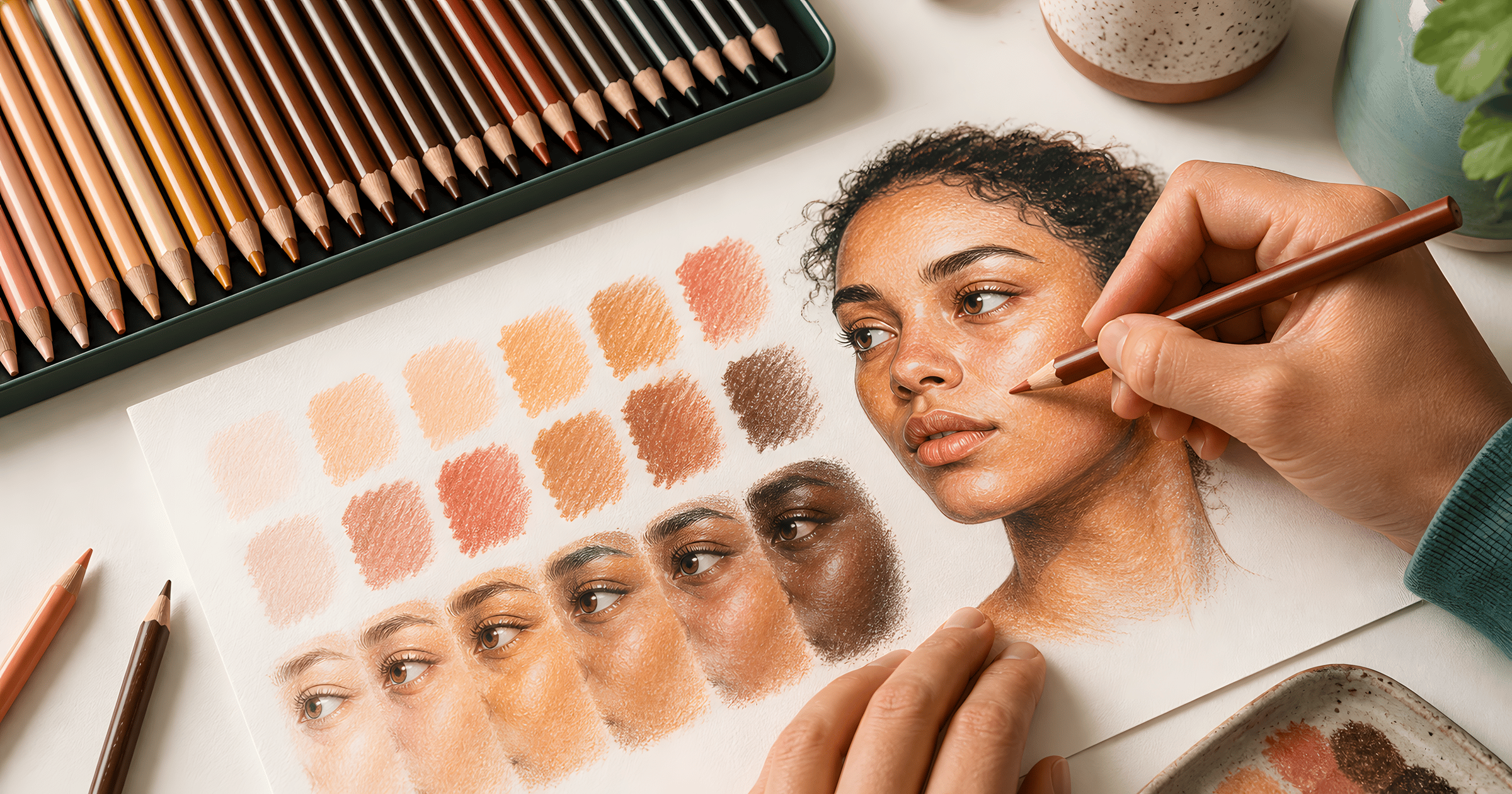
Real skin is a stack. An undertone glowing up from underneath, a main tone over it, shadows that run cooler than either, and a touch of red where blood sits near the surface, the cheeks and the knuckles and the ears. Color it as a stack and it comes alive. This guide is the entire method, no art degree required, and it works with whatever pencils are already in the drawer.
The three-pencil stack
Undertone first. A light warm layer over every patch of skin on the page, pressed so gently it barely registers. Golden yellow for warm-leaning skin, a soft rose for pink-leaning, light orange for olive and deeper tones. This layer disappears under everything else and somehow makes the finished result glow. Skipping it is why colored skin reads as plastic.
Main tone in the middle. Two or three light passes of the actual skin color, letting the undertone breathe through. The tooth of the paper can only hold so much wax, so saturation gets earned across passes. Pressing hard early crushes the tooth flat and later layers just slide off.
Shadow and blush last. Shadows along one consistent side, under the chin, below the hairline. And the counterintuitive part, shadow with a plum or a cool brown rather than the main tone pressed harder, because shadows in real light run cooler than the skin around them. Then the smallest touch of red or coral on cheeks and knuckles. That final touch is what reads as alive from across the room.
Recipes by depth
Pencil names vary by brand, so these are described by job. Test any trio as swatches on scrap paper before committing, thirty seconds well spent.
| Depth | Undertone | Main tone | Shadow | Blush |
|---|---|---|---|---|
| Fair | palest yellow | light peach | soft plum | pink |
| Light | cream yellow | peach or sand | dusty violet | coral |
| Medium | golden yellow | tan to caramel | cool brown | warm red |
| Olive | light orange | khaki-leaning tan | gray-violet | muted red |
| Deep | orange | sienna to chestnut | plum-brown | deep red |
| Rich deep | red-orange | dark umber | cool violet | crimson |
Deeper tones are the more rewarding end of this table, in my opinion. The undertone gets to be properly orange, the highlights get dramatic, and the contrast does half the modeling for you. Whatever the depth, the physical reason undertones exist is melanin and blood showing through skin at different concentrations, which the science writeup covers if a curious kid asks why knuckles are redder..
This walkthrough names every pencil as it goes, light through deep, and pairs well with the table above.
The ten-minute practice drill
Six rough circles on scrap paper. The first three get the same stack at three depths from the table. The last three repeat the depths with a different undertone. Twelve minutes, and the result is a personal reference card built from pencils you own, which beats any downloaded chart.
Then move to real practice targets. Start with a page where the face and hands are large enough to study, not hidden in a crowded scene. These two sheets are built for exactly that.
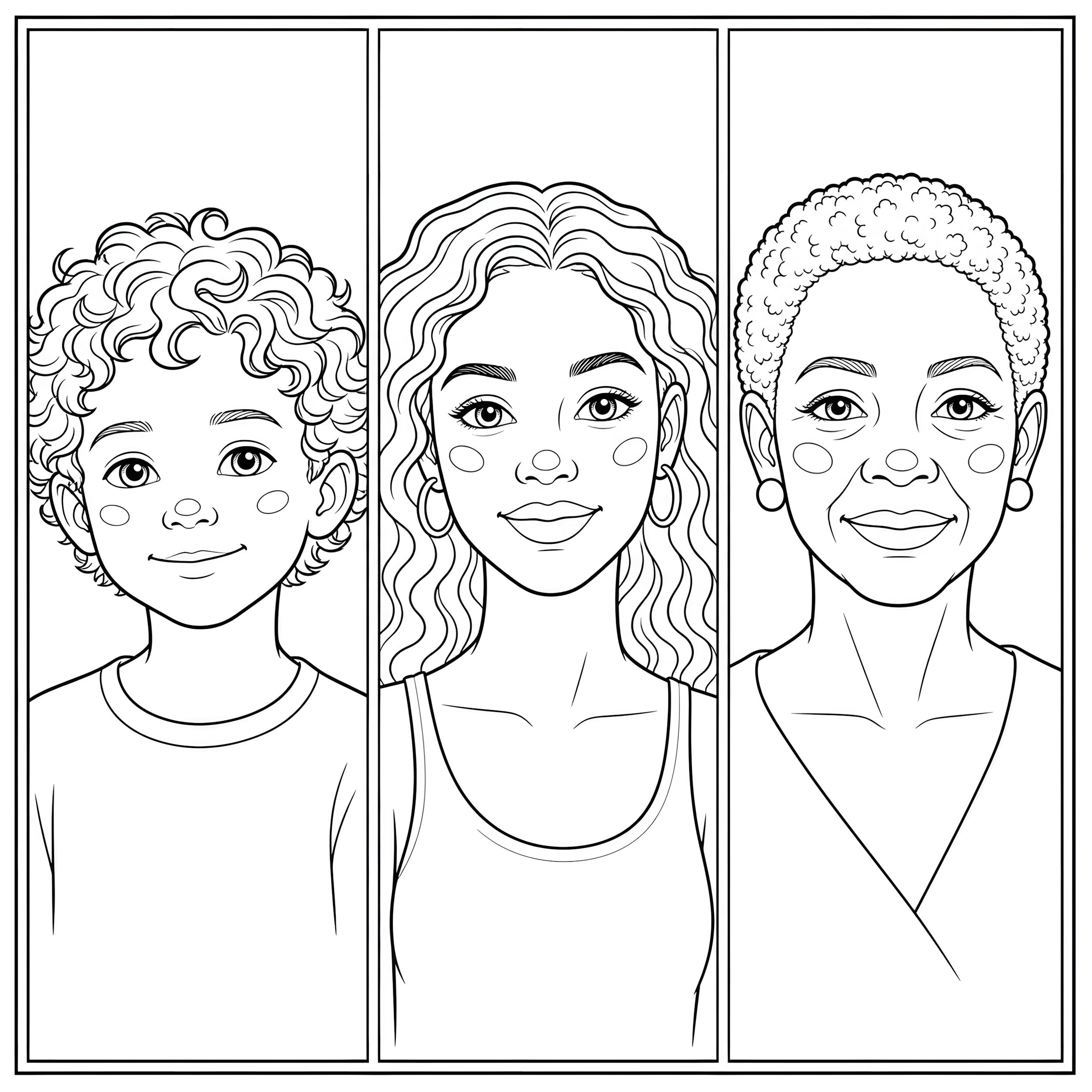
The portrait study gives you three faces at different depths, with cheeks, ears, necks, and small highlight shapes you can layer without guessing where the skin ends.
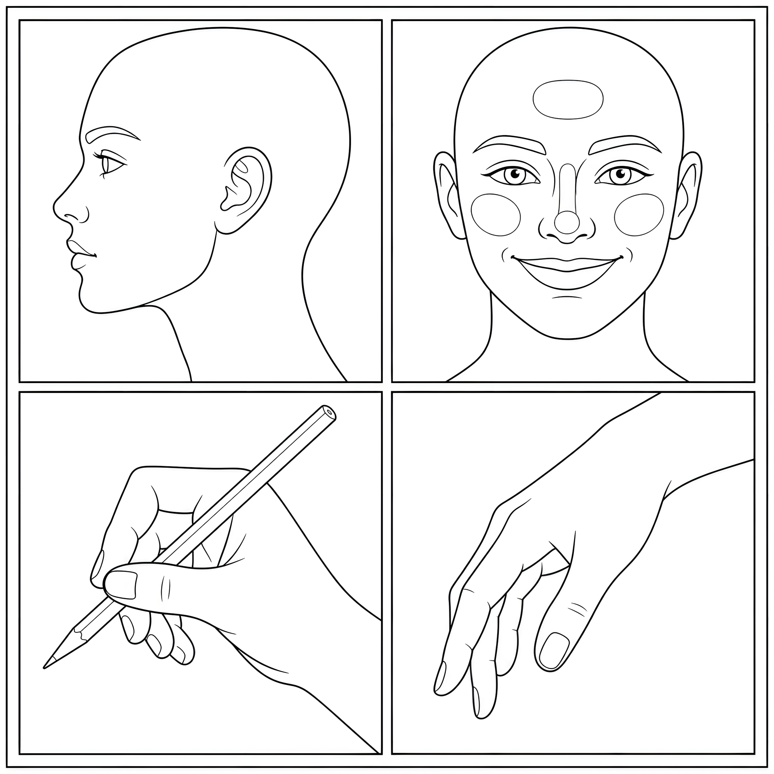
The hands and faces study is where the method gets honest: skin on a cheek, an ear, a knuckle, and a hand all needs the same undertone logic, but not the same pressure.
Where it goes wrong
The waxy shine. Too much pressure too early, tooth crushed, done. Feather-light first passes are the fix, with burnishing saved for the very end if at all.
The gray zombie. Shadowing with actual gray or black. Cool browns and plums always. Black is for line art.
The mask. A carefully colored face above one flat-toned neck. Whatever stack the face got, every visible patch of skin gets, hands included, and yes it takes longer, and yes it is worth it.
The mud. More than four pencils in one stack, usually from fiddling. When a swatch goes muddy the culprit is nearly always pressure rather than color choice. Lighter hands, more layers.
Mistakes lift better than people expect, for what it's worth. A kneaded eraser pressed and lifted, never rubbed, pulls back the top layer, and a bit of removable tape dabbed gently does the same on sturdy paper.
Fine-tuning warmth
A finished patch of skin sometimes reads slightly off, and the fix is a whisper-light adjustment layer over the whole area. Too pale or lifeless, glaze a warm red over everything. Too hot or sunburned-looking, a feather pass of green or soft blue calms it down, since a color's complement mutes it without graying it the way black would. If a cheek went too pink, the lightest touch of green brings it back. Ten seconds of glazing rescues most of the disasters that feel permanent.
Pick the light direction before the first layer goes down, one side of the page, and keep every shadow loyal to it. Faces lit from two directions at once are the mistake nobody can name but everybody notices.
For anyone who wants a shopping-list version, one field-tested trio runs Cinnamon for the light layer, Burnt Carmine for the mid, Van Dyck Brown for shadow, names you'll find across the big pencil brands. Treat it as a starting point rather than gospel, and swatch before trusting it, since the same name shifts a little from brand to brand.
Markers, briefly
Markers can do skin and do it fast, but they don't forgive. One wrong pass is permanent, blending windows close in seconds, and cheap paper feathers. Learn the stack in pencil first, then transfer the layering order if markers call to you. Paper weight matters double there, which the paper guide sorts out cheaply.
The mechanics underneath everything here, pressure control and layering order and edge softening, are the same ones in how to color with colored pencils. Smooth transitions between main tone and shadow lean on blending, and stubborn pasted-on shadows are diagnosed in how to shade.
FAQ
What colors make skin tone with colored pencils?
A light warm undertone, a main tone anywhere from peach to deep umber, a cool dark for shadow, and a touch of red for cheeks and knuckles. Three or four pencils, never one.
How do I color dark skin tones so they don't look flat?
Same stack, richer ingredients. Orange or warm red undertone, layered browns on top, cool violet shadows, and keep the highlights bold. Deep skin rewards contrast, so resist the urge to mute it.
What if I only have a 12-pack?
Fine for two or three depths. Yellow, peach, brown, and violet cover the fair-through-medium rows, and the drill above shows exactly what your specific twelve can do.
What should I practice on?
Swatch circles first, then the portrait study and hands and faces study above.
Three pencils, feather pressure, undertone first. Print the portrait study and give the drill ten minutes tonight.