Pattern people are a particular type, and I say it with affection because I am one. A scene is a story. A pattern is a system, and coloring one is watching a rule play out across the page in your own hand. If scales and tiles and tessellations make something in your brain go quiet and pleased, this whole page is for you.
Everything below is free, prints on plain letter or A4, and opens in the browser tool for tap-fill people.
The three to try first.
- Geometric mosaic
- Mandala lotus
- Stained glass window, the forgiving one
The three families of pattern
Patterns sort into families, and knowing which family a page belongs to tells you how to color it before you start.
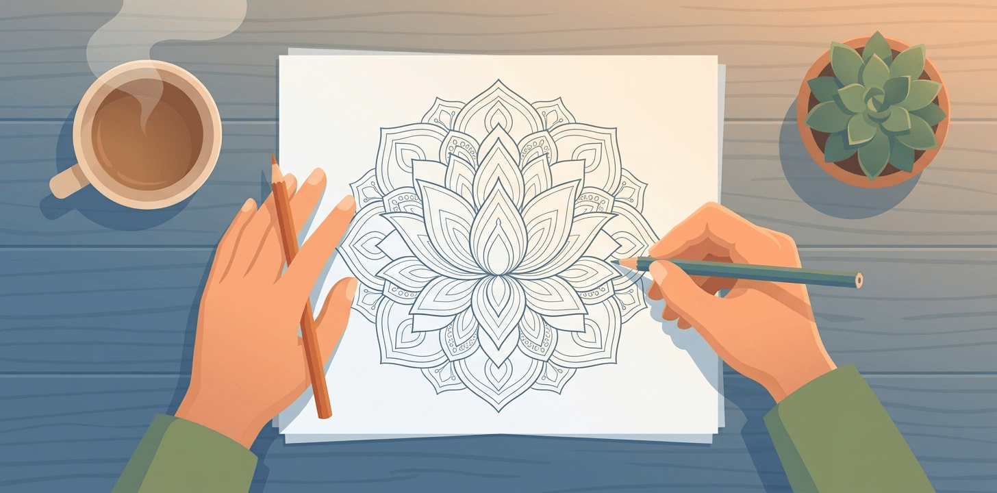
Radial, the mandalas
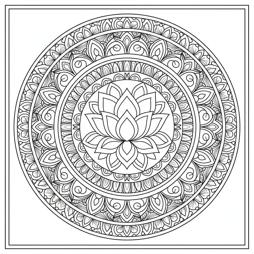
Everything radiates from a center. The lotus is the clean example, worked ring by ring from the middle out, and the moonlit owl hides a bird inside the same structure.

There is even a cat mandala for the crossover audience, which I did not expect to endorse and yet.
Tiled, the mosaics
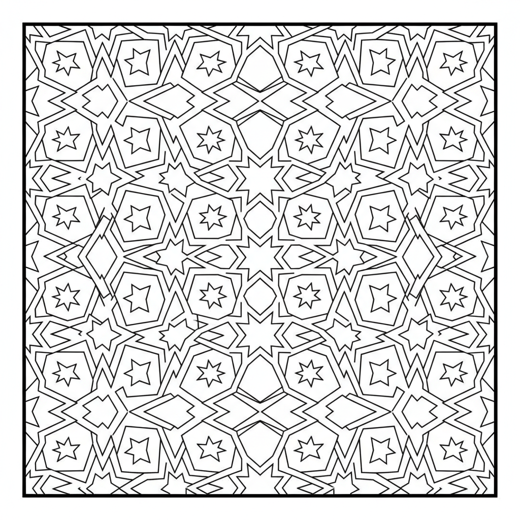
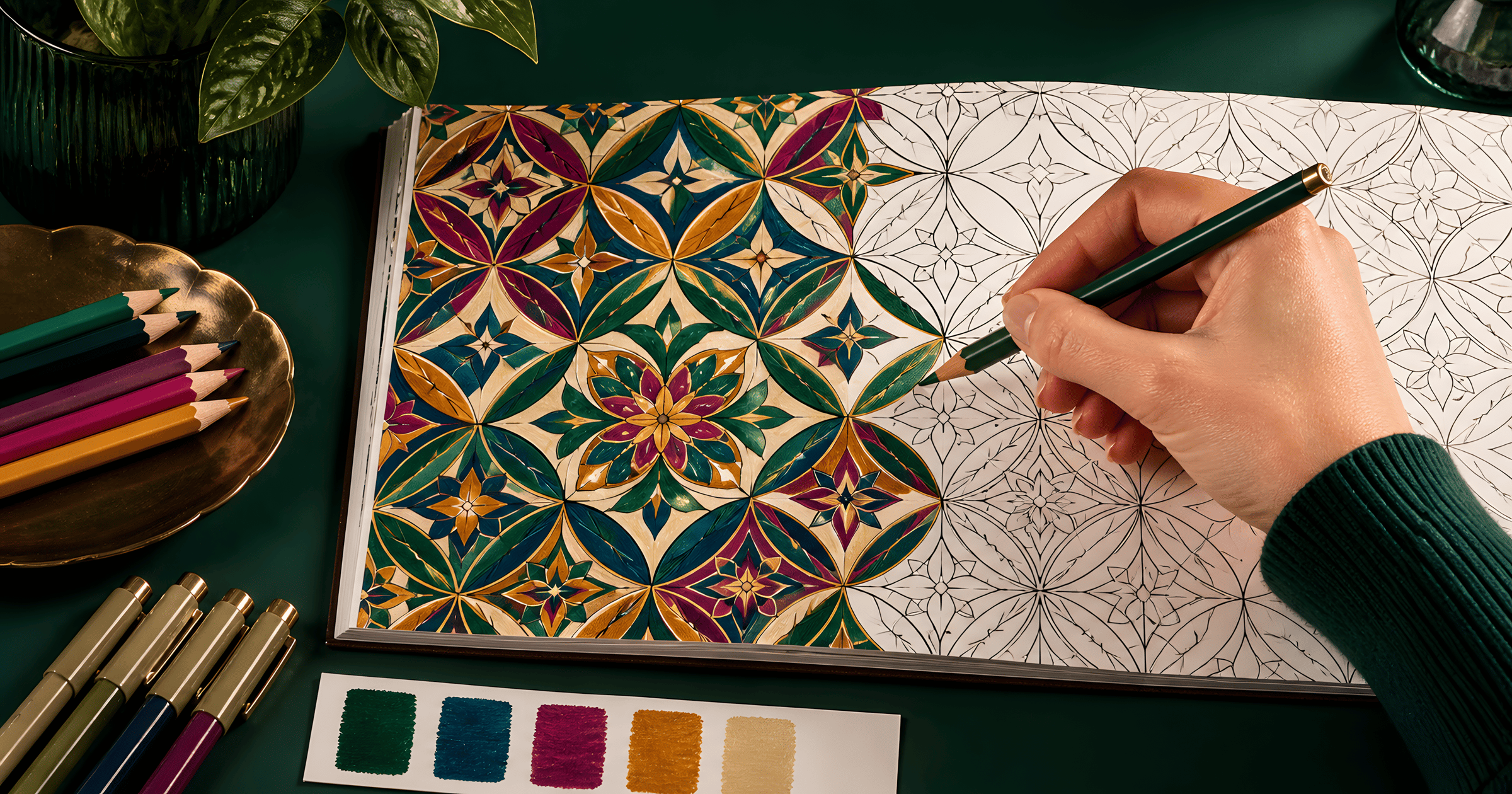
Shapes that fit together edge to edge with no gaps. The mosaic is pure system, ruler-sharp and unforgiving in the best way. Mathematicians call the underlying idea tessellation, and craftsmen were laying these patterns in tile centuries before anyone printed one on paper.
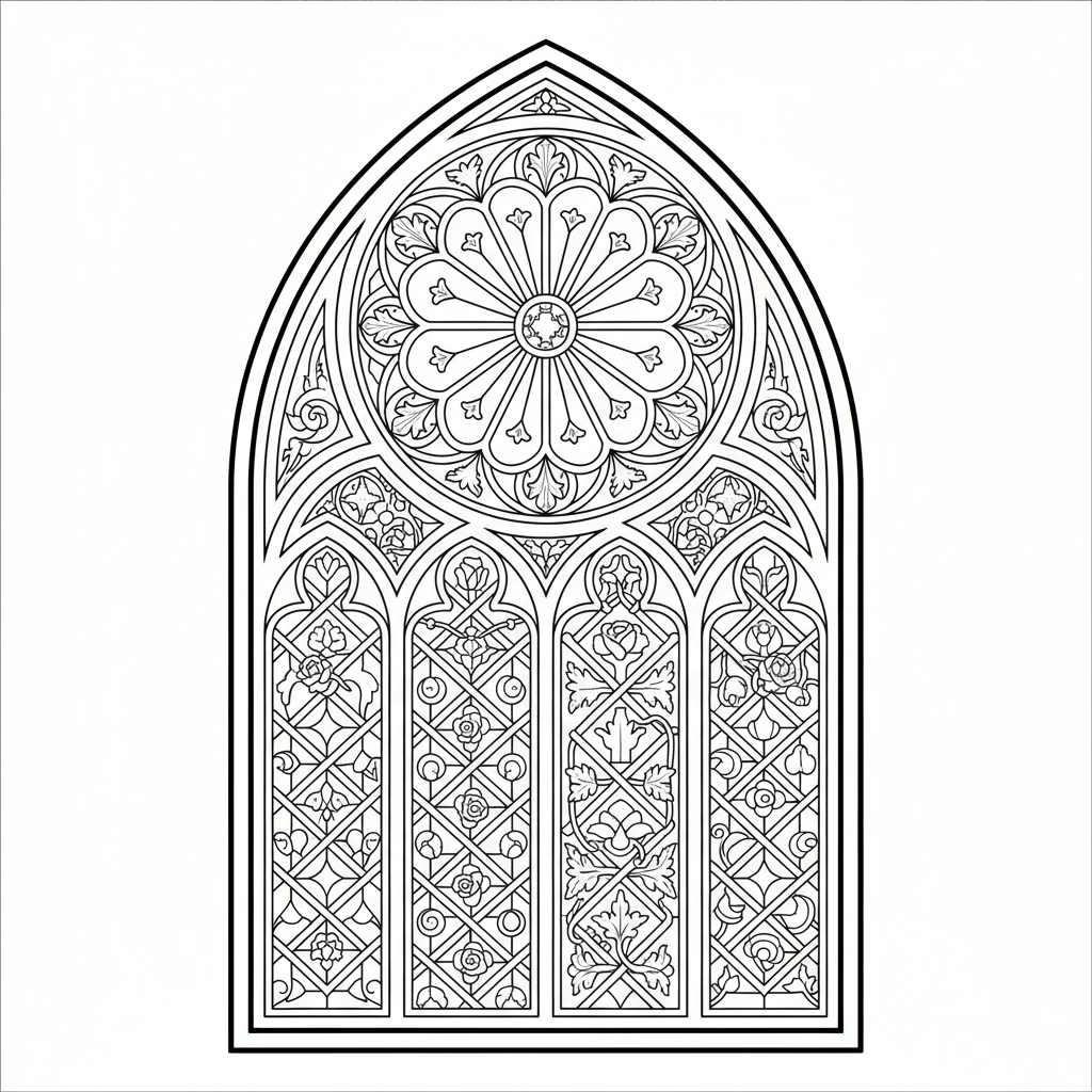
The stained glass window is the beginner door into this family. Heavy black lines between segments make every color read jewel-bright regardless of skill, and the finished page looks dramatic on a wall far beyond the effort it took. Windows like these have been glowing in old churches for eight hundred years, so the design has had time to prove itself.
Organic, the grown ones
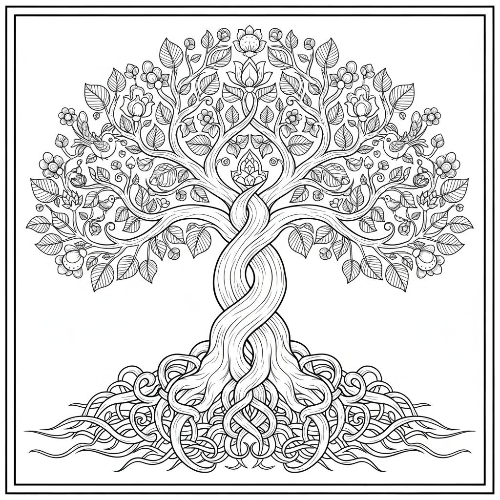
Patterns that nature drew first. The tree of life weaves branches and roots into a circle, the zen garden turns raked sand into long parallel lines you cannot hurry, and the shiny beetle is a natural mosaic wearing an insect costume. Sleeper pick of the entire page, the beetle.
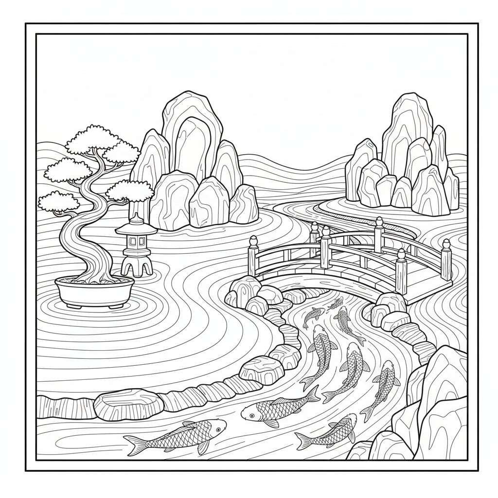
The rest of the shelf, koi scales and coral included, lives in the adult collection.
Three systems for coloring any pattern
Alternate by rule
Pick two or three colors and assign them by position. Every third tile teal. The rule does the design thinking, you execute, and executing a rule is precisely the pleasant part. Beginners get the most professional-looking result per unit of effort this way, and it is how I color the mosaic every single time.
Gradient across the structure
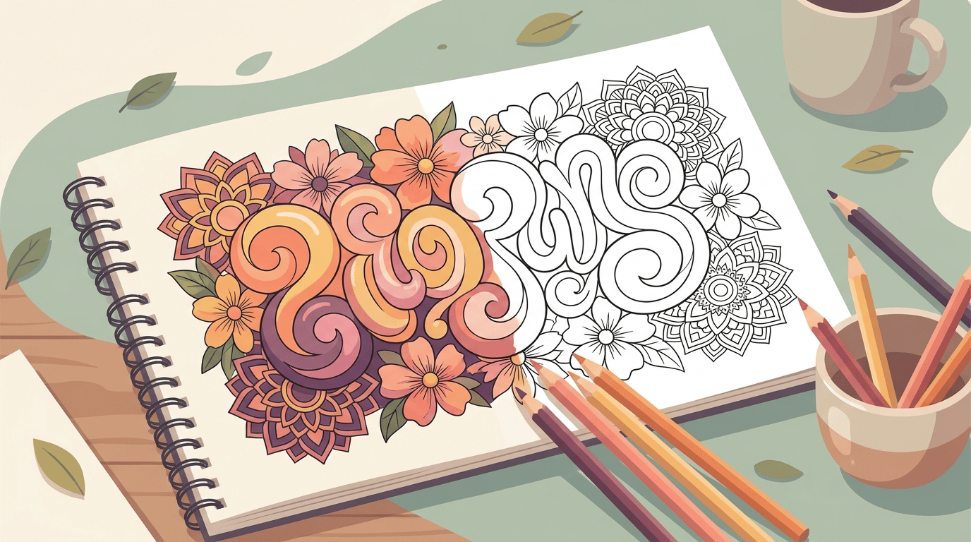
One color family, light at the center, dark at the rim. On a mandala this reads as a glow and looks far harder than it is. Pencils beat markers here since the fade depends on pressure, and the blending techniques transfer directly. Watch it done at real speed.
Chaos inside the order
Every region a different color, no rule at all. The structure holds it together no matter what gets thrown at it, which is the secret reason patterns forgive beginners and children so well. Kids color this way by default, and a pattern page is genuinely one of the best shared tables for a kid and an adult working side by side on the same sheet.
Palettes that flatter each family
Radial designs want a temperature story. Warm center cooling toward the rim, or the reverse, and the mandala reads as designed either way. Random warm-cool mixing is the one choice that reliably fights the structure.
Tiled patterns thrive on strict small palettes. Two colors on the mosaic look architectural. Three look intentional. Six look like a spill, in my experience, though the chaos system above is the licensed exception. For the stained glass specifically, jewel tones between those black lines, ruby and sapphire and emerald with one amber, are basically unlosable.
Organic patterns take whatever nature would take. Greens layered on greens for the zen garden, bark browns for the tree, and the beetle is the standing invitation to go iridescent, blues shading into greens shading into violet on one shell.
Two depth tricks worth stealing
Dimension is the cheap upgrade on any tiled pattern. Wherever the design implies a 3D form, cubes and steps and folds, put the darker shade on the top faces and keep the sides lighter, and the page pops off the paper. Sounds backwards. Try it on three tiles of the mosaic and you'll see.
The glow is the radial equivalent. On a mandala, run one color family in sequence from lightest at the center to darkest at the rim, no skipped steps. Done patiently it reads like the page is lit from inside, and it is the single technique visitors comment on when a finished one is hanging up.
Training the pattern eye
Patterns don't stay on the page once you start noticing them. The weave of a shirt, tree bark, the tiles behind the sink, the spots on the neighbor's dog. Kids especially take to the noticing game, find five patterns before dinner, and it costs nothing while quietly teaching them to look at ordinary things with attention. The doodled version of all this has a name, zentangle, and the freehand crowd draws their repeats from scratch, but a printed page gets you the same settled feeling without the blank-paper hurdle.
Finished pattern pages also bind beautifully into a homemade book, since they look coherent as a set in a way scene pages never quite do. The DIY coloring book method takes fifteen minutes, and a self-made pattern book is a genuinely good gift for the puzzle-minded person in your life.
Supplies, briefly
Fineliners or sharp pencils for the mosaic and the mandalas. Anything at all for the stained glass. Markers saturate beautifully on tiled patterns but bleed through standard paper, so slide a scrap sheet under or check weights in the paper guide. Patterns also happen to be the core of the stress relief shelf, repetition without focal points being the calming formula, so the same pages do double duty on hard weeks.
Print the mosaic, pick three colors and one rule, and let the system do the relaxing.